
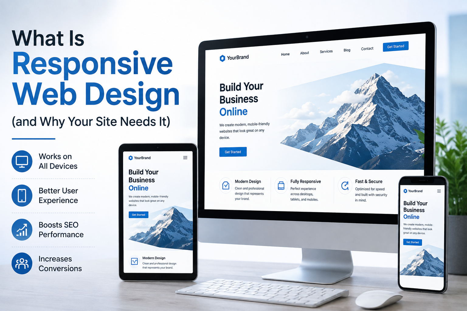
Responsive web design is an approach to website design that allows a website to automatically adapt to different screen sizes, devices, and orientations. Whether someone visits your website from a desktop computer, tablet, or smartphone, the layout, images, navigation, and content adjust to provide a usable experience.
For small businesses, responsive web design is no longer simply a design preference. It is an important part of creating a professional online presence, making your website easier to use, and helping potential customers find the information they need.
If your website looks great on a desktop but is difficult to use on a phone, you may be losing visitors and potential customers.
This guide explains what responsive web design means, how it works, why it matters for small businesses, and what to look for when hiring a professional web designer.
What Is Responsive Web Design?
Responsive web design is a method of building websites so that the website’s layout and content can adapt to the visitor’s screen size.
Instead of creating one fixed layout for desktop computers and another completely separate website for mobile users, a responsive website uses flexible layouts, images, typography, and CSS rules to adjust the page according to the available screen space.
For example, a responsive website might:
- Display three columns on a desktop screen.
- Reduce those columns to two on a tablet.
- Stack the content into a single column on a smartphone.
- Resize images automatically.
- Make buttons easier to tap on smaller screens.
- Adjust navigation for mobile users.
- Change font sizes and spacing for better readability.
The goal is simple: your website should remain easy to use regardless of the device someone uses to access it.
Responsive Design in Simple Terms
Think of responsive web design like a storefront that rearranges itself depending on how much space is available.
A large desktop screen gives your website plenty of room to display menus, images, text, products, and calls to action side by side.
A smartphone has much less space, so the same website needs to rearrange those elements vertically and make them easier to interact with.
The website’s content does not necessarily change. The presentation changes to fit the screen.
How Does Responsive Web Design Work?
Responsive websites generally rely on a combination of flexible layouts, CSS media queries, responsive images, scalable typography, and mobile-friendly navigation.
1. Flexible Layouts
A responsive layout uses flexible dimensions rather than relying entirely on fixed pixel widths.
This allows sections of a page to expand or contract according to the visitor’s screen size.
For instance, a desktop page might show a text section beside an image. On a smartphone, those elements can stack vertically so that the text and image remain readable.
2. CSS Media Queries
Media queries allow designers and developers to apply different styling rules depending on characteristics such as screen width.
For example, a website can use one layout for larger screens and another arrangement for smaller screens.
This makes it possible to create a website that responds intelligently to different devices without requiring a separate mobile website for every screen size.
3. Responsive Images
Large images can create problems on smaller screens if they are not handled properly.
Responsive design allows images to scale within their available space while maintaining their proportions.
A professional website should also consider image file sizes because unnecessarily large images can contribute to slower page loading.
4. Flexible Typography
Text that looks comfortable on a desktop may be too large, too small, or poorly spaced on a smartphone.
Responsive typography helps headings, paragraphs, buttons, and other text elements remain readable across different screen sizes.
5. Mobile-Friendly Navigation
Desktop navigation often has enough room for several menu items.
A smartphone does not.
Responsive websites commonly use a compact navigation menu on smaller screens, allowing users to reach important pages without having to zoom or scroll through an oversized desktop menu.
Why Does Your Small Business Need Responsive Web Design?

For a small business, your website often serves as a first impression.
A potential customer may discover your business through search, social media, a referral, an online advertisement, or a business listing. If they click through to your website and find that it is difficult to navigate on their phone, they may leave before contacting you.
Responsive web design helps address that problem.
Here are the major reasons it matters.
1. Your Customers Use Different Devices
Your audience does not necessarily visit your website from the same device.
One customer may research your services from a laptop at work. Another may find your business while using a smartphone. Someone else may compare your company with competitors from a tablet.
A responsive website gives all of these visitors a consistent experience.
You do not need to know exactly which device every visitor will use. Your website should adapt to them.
2. Responsive Design Improves the User Experience
User experience is one of the most important reasons to invest in responsive web design.
Visitors should be able to:
- Read your content without excessive zooming.
- Navigate your website easily.
- Tap buttons without accidentally hitting other links.
- Find your contact information quickly.
- Complete forms on smaller screens.
- View images without awkward cropping.
- Understand what your business offers.
If visitors have to pinch, zoom, rotate their phone, or repeatedly scroll sideways to use your website, the experience needs improvement.
A responsive website removes much of that friction.
3. It Helps Your Business Look More Professional
Your website communicates something about your business before a customer ever speaks with you.
A website that works smoothly across devices can make your business appear more established, organized, and trustworthy.
On the other hand, an outdated website with broken layouts, tiny text, overlapping elements, or difficult mobile navigation can create the opposite impression.
For small businesses competing with larger companies, professional website presentation can be especially important.
4. Responsive Design Can Support SEO
Responsive design is closely connected with mobile-friendly website experiences and technical SEO.
Search engines need to understand and crawl your website efficiently, while visitors need to be able to access and use the content.
A responsive approach can simplify website management because you are maintaining one primary website experience rather than trying to keep separate desktop and mobile versions synchronized.
However, responsive design alone does not guarantee higher rankings.
SEO also depends on factors such as:
- Helpful and original content.
- Search intent.
- Website architecture.
- Technical accessibility.
- Page experience.
- Internal linking.
- Relevant authority and reputation.
- Crawlability and indexability.
- Quality backlinks and mentions.
Responsive design should therefore be viewed as an important part of a broader SEO and website strategy rather than a standalone ranking solution.
5. It Can Help Reduce Friction Before a Purchase
Small business websites are often designed around a few important actions.
For example, you may want visitors to:
- Call your business.
- Request a quote.
- Book an appointment.
- Submit a contact form.
- Purchase a product.
- Visit your physical location.
- Learn about your services.
If those actions are difficult to complete on a smartphone, you create unnecessary friction.
Responsive design makes it easier to place important calls to action where users can see and interact with them.
A mobile visitor should not have to search through several pages just to find your phone number.
What Does a Responsive Website Look Like?
A responsive website does not necessarily look identical on every device.
Instead, it maintains the same brand, content, and overall purpose while changing its layout to suit the available screen space.
For example, imagine a small plumbing company’s website.
On a desktop
The homepage might show:
Logo | Services | About | Reviews | Contact
Below the navigation could be:
- A large headline.
- A service description.
- A professional image.
- Customer reviews.
- Multiple service cards.
- A prominent quote button.
On a smartphone
The same page could become:
- Logo and compact menu.
- Short headline.
- Service description.
- Image.
- Stacked service sections.
- Reviews.
- Large tap-friendly “Request a Quote” button.
The information remains consistent, but the layout changes to make the content easier to use.
Responsive Web Design vs. Mobile-Friendly Design
The terms responsive design and mobile-friendly design are often used interchangeably, but they are not exactly the same.
Responsive Web Design
Responsive design refers to the technical approach of creating a layout that adapts to different screen sizes.
Mobile-Friendly Design
Mobile-friendly is a broader description of a website that is easy to use on mobile devices.
A website can technically respond to a smaller screen but still provide a poor experience.
For example, a page may technically fit on a phone but still have:
- Tiny text.
- Hard-to-tap buttons.
- Poor spacing.
- Slow-loading media.
- Confusing navigation.
- Intrusive pop-ups.
A truly effective website needs more than a layout that simply shrinks.
The goal is not just to make a website fit a phone. The goal is to make the website work well for the person using it.
Responsive Web Design vs. Adaptive Web Design
Responsive and adaptive design are related but use different approaches.
Responsive Design
A responsive layout continuously adjusts according to the available screen space.
Adaptive Design
Adaptive design typically uses predefined layouts designed for particular screen sizes or device categories.
For most small businesses, the more important question is not which label a designer uses.
The better question is:
Does the website provide a fast, accessible, easy-to-use experience across the devices your customers use?
A professional web design expert can determine the right implementation based on your business, audience, technology, and goals.
What Are the Main Benefits of Responsive Web Design?
A well-built responsive website can provide several practical benefits for a small business.
Better Mobile Usability
Visitors can browse your website without constantly zooming or repositioning the page.
Consistent Branding
Your colors, typography, imagery, messaging, and visual identity remain consistent across devices.
Easier Website Management
A responsive approach can reduce the need to maintain separate desktop and mobile website versions.
Better Accessibility
Responsive layouts can make content easier to read and interact with across different screen sizes.
Stronger Customer Experience
Visitors can find important information and complete actions more easily.
Better Support for Digital Marketing
Landing pages, advertising campaigns, social media traffic, and search traffic all benefit from a website that works properly across devices.
More Professional Online Presence
A modern, adaptable website can reinforce confidence in your business.
How to Tell If Your Website Is Not Responsive
Not sure whether your website needs an upgrade?
Look for these warning signs.
Your website requires horizontal scrolling
If users need to move the page from left to right to see the full content, the layout may not be properly optimized for smaller screens.
Text is difficult to read
Visitors should not have to zoom in to read your headings or paragraphs.
Buttons are difficult to tap
Important calls to action should have enough space around them to be comfortably used on a touchscreen.
Images break the layout
Images should not extend beyond the screen or cause content to become difficult to view.
Navigation is frustrating
If visitors cannot easily find your services, contact information, pricing, or other important pages on mobile, your navigation needs attention.
Forms are difficult to complete
A contact or quote form that works well on desktop may become frustrating on a phone if fields are too small or the layout is cramped.
The page feels like a shrunken desktop website
This is one of the clearest warning signs.
A good mobile experience should feel intentionally designed—not like someone simply squeezed a desktop page into a smaller screen.
How to Make a Website Responsive
Creating a responsive website requires more than adding a mobile menu.
A professional web design process typically considers the entire experience.
Start With a Flexible Layout
The layout should be designed to adapt rather than depend on a single fixed screen width.
Design for Smaller Screens
Mobile visitors should be considered from the beginning rather than treated as an afterthought.
Optimize Images
Images should be appropriately sized and delivered efficiently so they do not unnecessarily slow down the page.
Create Clear Navigation
Visitors should be able to find your main pages quickly, especially your services, contact information, location, and key calls to action.
Make Forms Mobile-Friendly
Forms should use appropriately sized fields, logical spacing, clear labels, and a simple completion process.
Use Readable Typography
Text should remain comfortable to read without requiring visitors to zoom.
Test Across Devices and Screen Sizes
A responsive website should be tested across different viewport sizes and common devices.
Testing matters because a page can look perfect on one smartphone while still having problems at another screen width.
Is Responsive Web Design Important for Local Businesses?
Yes.
Responsive design can be particularly important for local businesses because customers often use their phones when searching for nearby services.
Imagine someone searching for:
“dentist near me”
“emergency plumber near me”
“best restaurant near me”
“roof repair company near me”
They may discover your business while already using a smartphone.
If they reach your website and cannot quickly determine:
- What you offer.
- Where you are located.
- When you are open.
- How to contact you.
- How to request a quote or appointment.
you may lose the opportunity.
For local businesses, mobile usability should therefore be connected to the entire customer journey from discovery to contact.
Does Responsive Design Improve Website Speed?
Responsive design and website speed are related, but they are not the same thing.
A responsive website can still be slow if it uses:
- Oversized images.
- Too many scripts.
- Poorly optimized plugins.
- Unnecessary third-party resources.
- Inefficient code.
- Heavy animations.
- Poor hosting or server configuration.
Likewise, a fast website can still provide a poor experience if its mobile layout is difficult to use.
A professional website should address both.
Responsive design focuses on how the site adapts. Performance optimization focuses on how efficiently it loads and responds.
Both contribute to a better overall website experience.
Is Responsive Web Design Worth It for a Small Business?
For most small businesses, yes.
Your website is often working for your business outside normal operating hours. It can introduce your services, answer common questions, establish credibility, generate leads, and encourage visitors to contact you.
If that website only works well on certain devices, you are limiting the effectiveness of an important business asset.
Responsive web design is particularly worthwhile if:
- Your website is several years old.
- Your mobile experience is difficult to use.
- Your website requires horizontal scrolling.
- Your contact forms are frustrating on phones.
- Your pages have broken mobile layouts.
- Customers frequently visit your website from smartphones.
- You are investing in SEO or digital advertising.
- You are redesigning your website anyway.
Should You Hire a Professional Web Designer?
If your website is important to your business, hiring a professional web design expert can be a smart investment.
Responsive web design involves more than changing the appearance of a website.
A professional needs to consider:
- User experience.
- Information architecture.
- Mobile usability.
- Accessibility.
- Branding.
- Conversion paths.
- Technical performance.
- SEO fundamentals.
- Content hierarchy.
- Forms and calls to action.
- Cross-device testing.
- Ongoing website maintenance.
A professional can also identify problems that may not be obvious when you view your website yourself.
What to Ask a Web Designer Before Hiring Them
Before choosing a web design professional, ask questions such as:
Will the website be responsive across different screen sizes?
Make sure responsive behavior is part of the actual project requirements.
How will you test the website on mobile devices?
A designer should have a clear testing process rather than relying on one device.
How will the website support SEO?
Ask about technical foundations, page structure, metadata, internal linking, and performance.
How will visitors be guided toward contacting my business?
Your website should have clear conversion paths rather than simply looking attractive.
Who will maintain the website after launch?
Understand who handles updates, security, content changes, backups, and technical issues.
Can I see examples of responsive websites you have designed?
Look at those websites on both desktop and mobile devices yourself.
Responsive Web Design Checklist for Small Businesses
Before launching or redesigning your website, use this checklist.
Design
- The layout adapts to different screen sizes.
- Branding is consistent across devices.
- Content remains easy to read.
- Images resize correctly.
- Navigation works on mobile.
- Buttons are easy to tap.
User Experience
- Contact information is easy to find.
- Important calls to action are visible.
- Forms work comfortably on mobile.
- Visitors can reach important pages quickly.
- There is no unnecessary horizontal scrolling.
SEO and Technical Foundations
- Pages have descriptive titles and headings.
- Internal links are logical.
- Images have appropriate alternative text where needed.
- Pages can be crawled and indexed.
- Performance has been tested.
- Structured data is implemented correctly where appropriate.
Business Goals
- The website clearly explains what the business offers.
- Services or products are easy to understand.
- Trust signals are visible.
- Contact or booking options are clear.
- The website supports the business’s lead-generation goals.
Frequently Asked Questions About Responsive Web Design
What is responsive web design in simple words?
Responsive web design means building a website so its layout automatically adapts to different screen sizes. The website can rearrange content, resize images, adjust typography, and change navigation so it remains usable on desktops, tablets, and smartphones.
Why is responsive web design important for small businesses?
Responsive design helps small businesses provide a better experience for customers using different devices. It can make websites easier to navigate, improve mobile usability, support marketing efforts, and create a more professional online presence.
Is responsive web design good for SEO?
Responsive design can support a strong technical and user experience foundation for SEO, but it does not guarantee higher rankings. Search performance also depends on content quality, relevance, technical SEO, website architecture, authority, and other factors.
How do I know if my website is responsive?
Open your website on a smartphone and look for problems such as horizontal scrolling, tiny text, overlapping content, broken images, difficult navigation, or buttons that are hard to tap. You can also test different screen widths using browser developer tools.
Is responsive design the same as mobile-friendly design?
Not exactly. Responsive design describes a technical approach in which a website adapts to available screen space. Mobile-friendly describes the broader outcome: a website that is easy and comfortable to use on mobile devices.
Can an old website be made responsive?
Often, yes. However, depending on the website’s platform, code, theme, plugins, structure, and age, it may be more practical to redesign or rebuild the website rather than modify the existing site.
Does responsive design make a website faster?
Not automatically. Responsive design helps a website adapt to different devices, while performance optimization focuses on loading and interaction speed. A professional website should address both areas.
Should I hire a professional to make my website responsive?
If your website is important for generating leads, sales, bookings, or customer inquiries, hiring a professional can help ensure that responsive design is implemented alongside usability, accessibility, SEO, performance, branding, and conversion strategy.
Final Thoughts: Your Website Should Work for Every Customer
A website should not force customers to adapt to it.
It should adapt to them.
Responsive web design helps ensure that your small business website remains usable whether someone visits from a desktop computer, tablet, or smartphone.
But responsive design is only one part of a successful business website. Your site should also communicate your value clearly, load efficiently, guide visitors toward meaningful actions, support SEO, and create confidence in your business.
If your current website looks outdated or works poorly on mobile devices, it may be time for a professional redesign.
Ready to improve your website? Hire a professional web design expert to evaluate your current site and build a responsive online experience that supports your business goals.